
The collection
Six looks. One story — yours.
Every Hope portfolio holds the same career timeline, the same skills map, the same proof of work. What changes is the type, the spacing, the mood. Scroll through the six — each modeled by a different career — and tap any look to open it live, or any face to see that person wearing it. There's no wrong answer here — just a look you'll want to send. Whichever you pick, it's step 2 of 8: Hope also finds your skill gaps, finds and verifies real jobs, and applies with your yes.
01
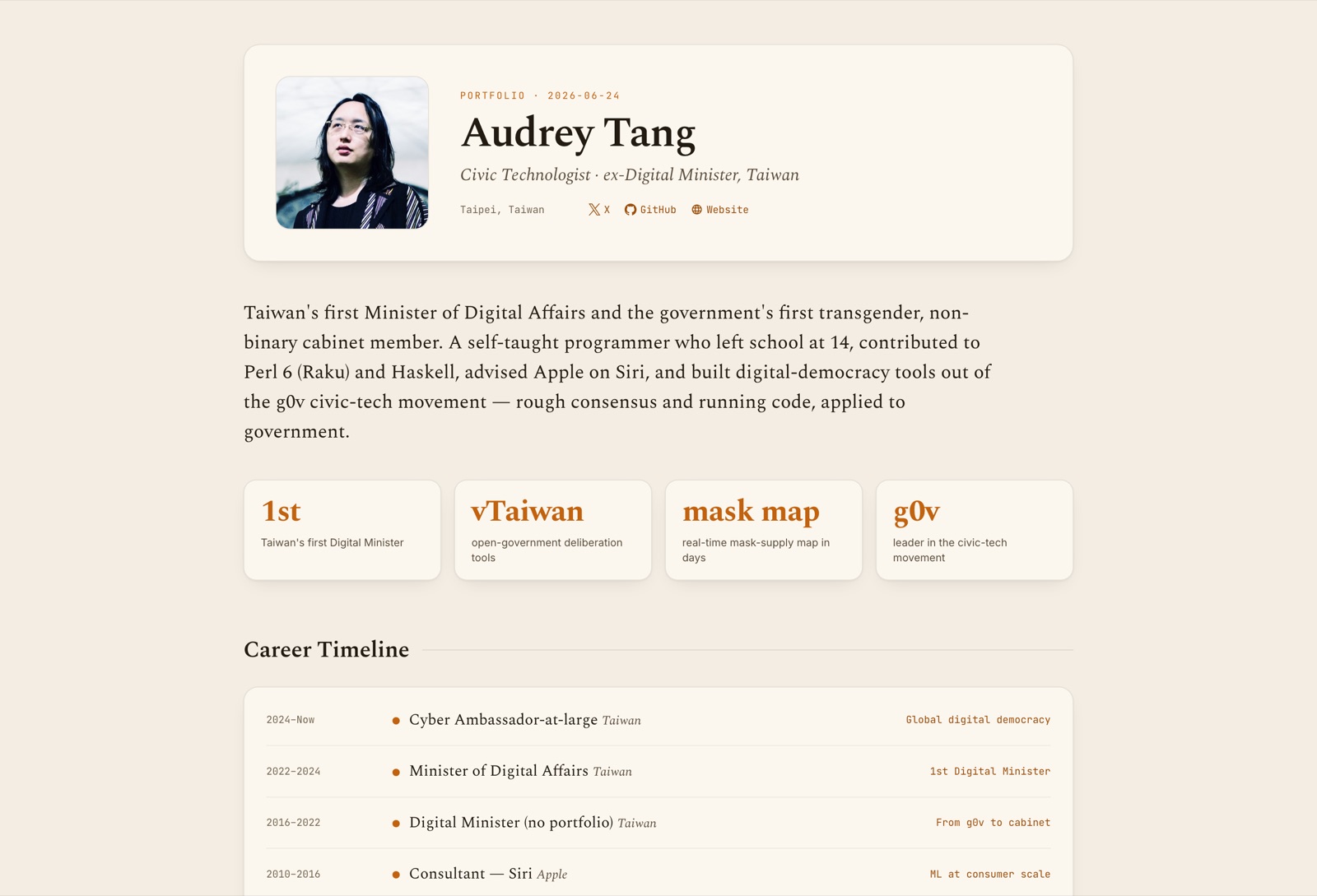
Standard
Hope's signature look — warm cream, confident type, a timeline that plays like a story.
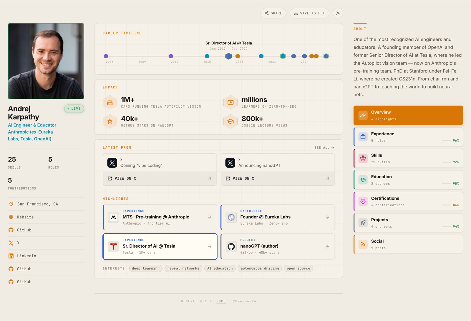 Open live →
02
Editorial
A magazine feature, not a résumé — serif headlines, deliberate rules, a page that reads like print.
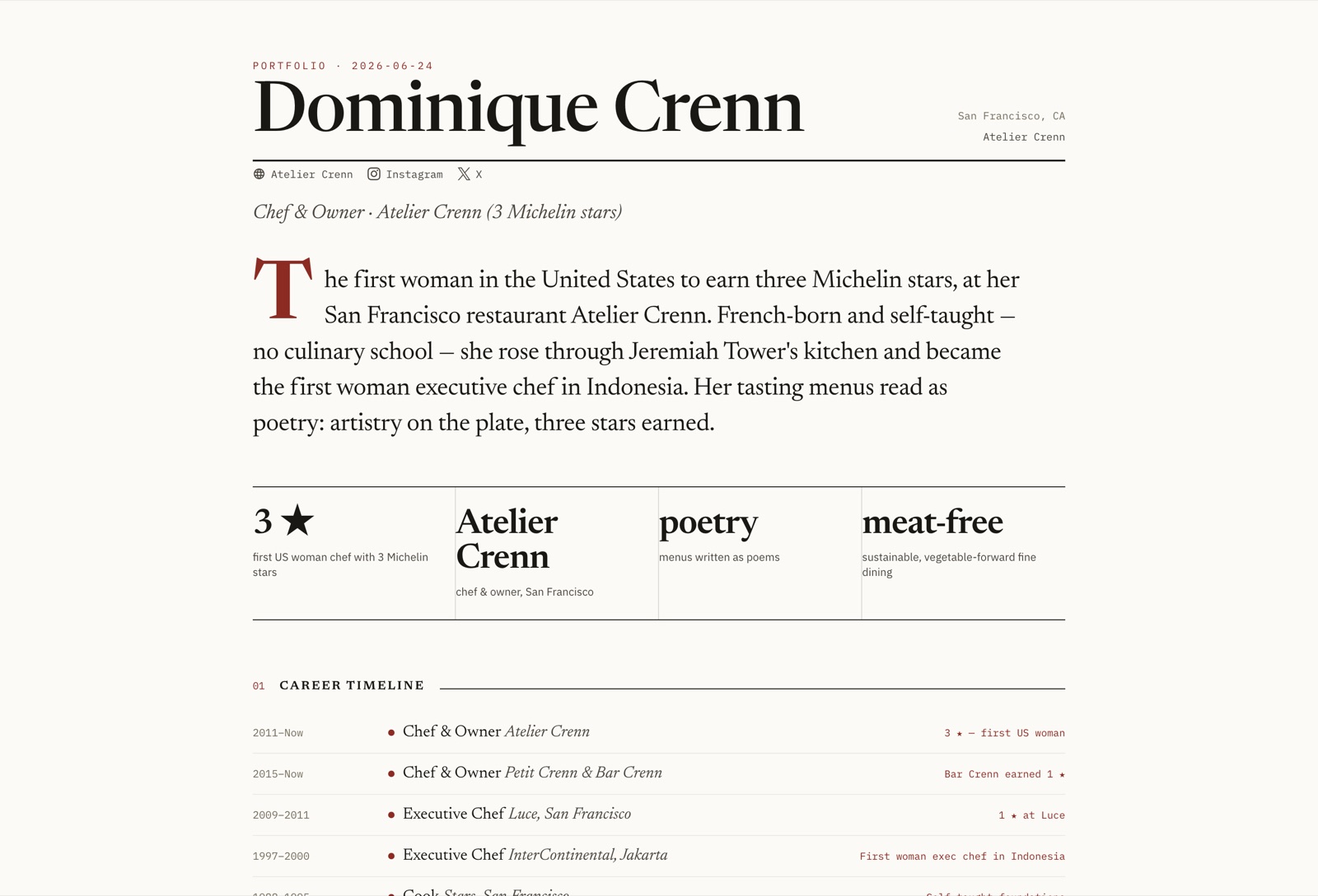 Open live →
03
Swiss Minimal
A grid with nothing to hide behind — red, black, and white, and work that has to earn its place.
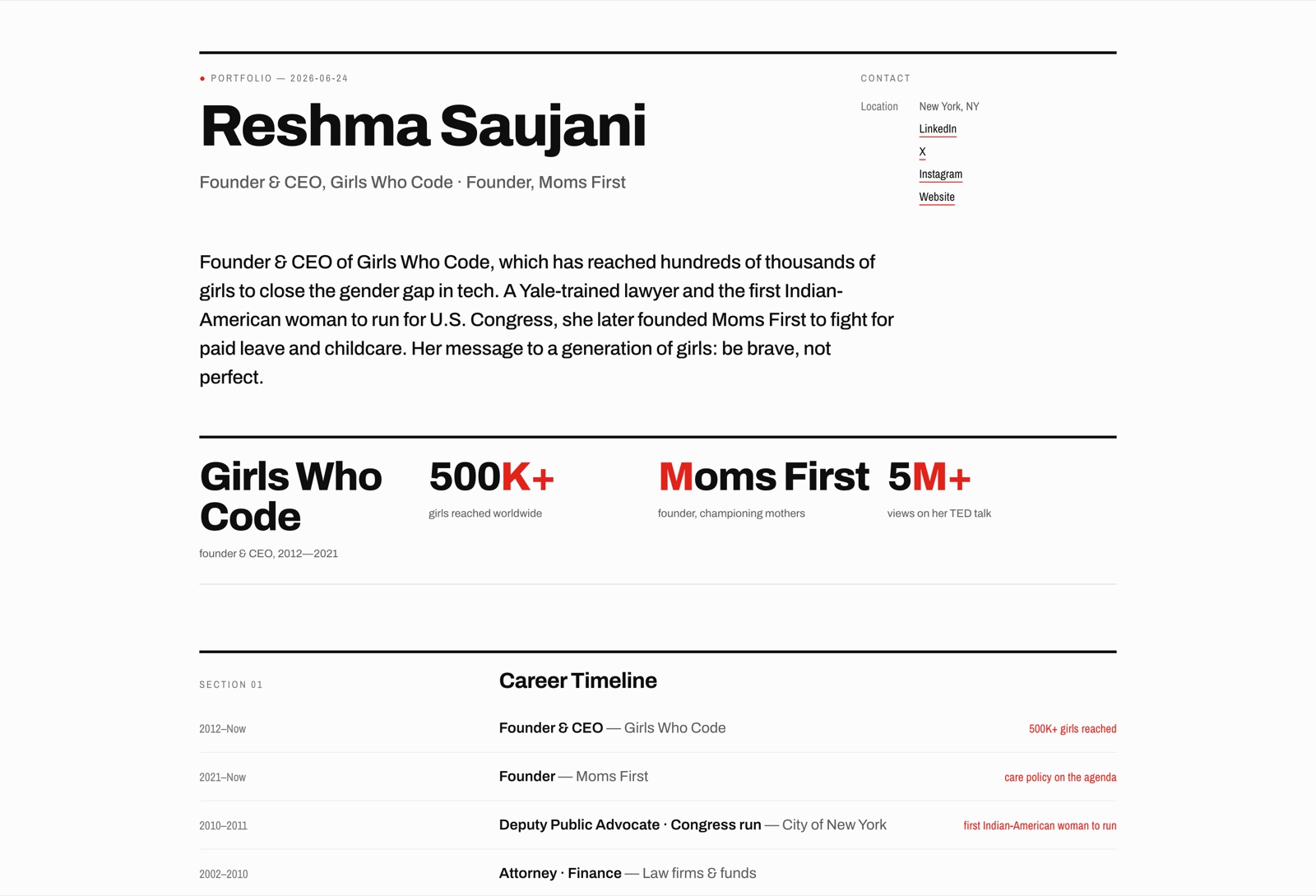 Open live →
04
Terminal
A console for people who live in one — monospace type, a blinking cursor, a career you could grep.
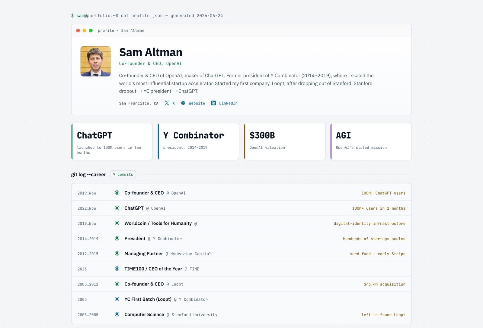 Open live →
05
Warm Refined
Soft light, generous margins, a page that feels handled with care rather than assembled in a hurry.
 Open live →
06
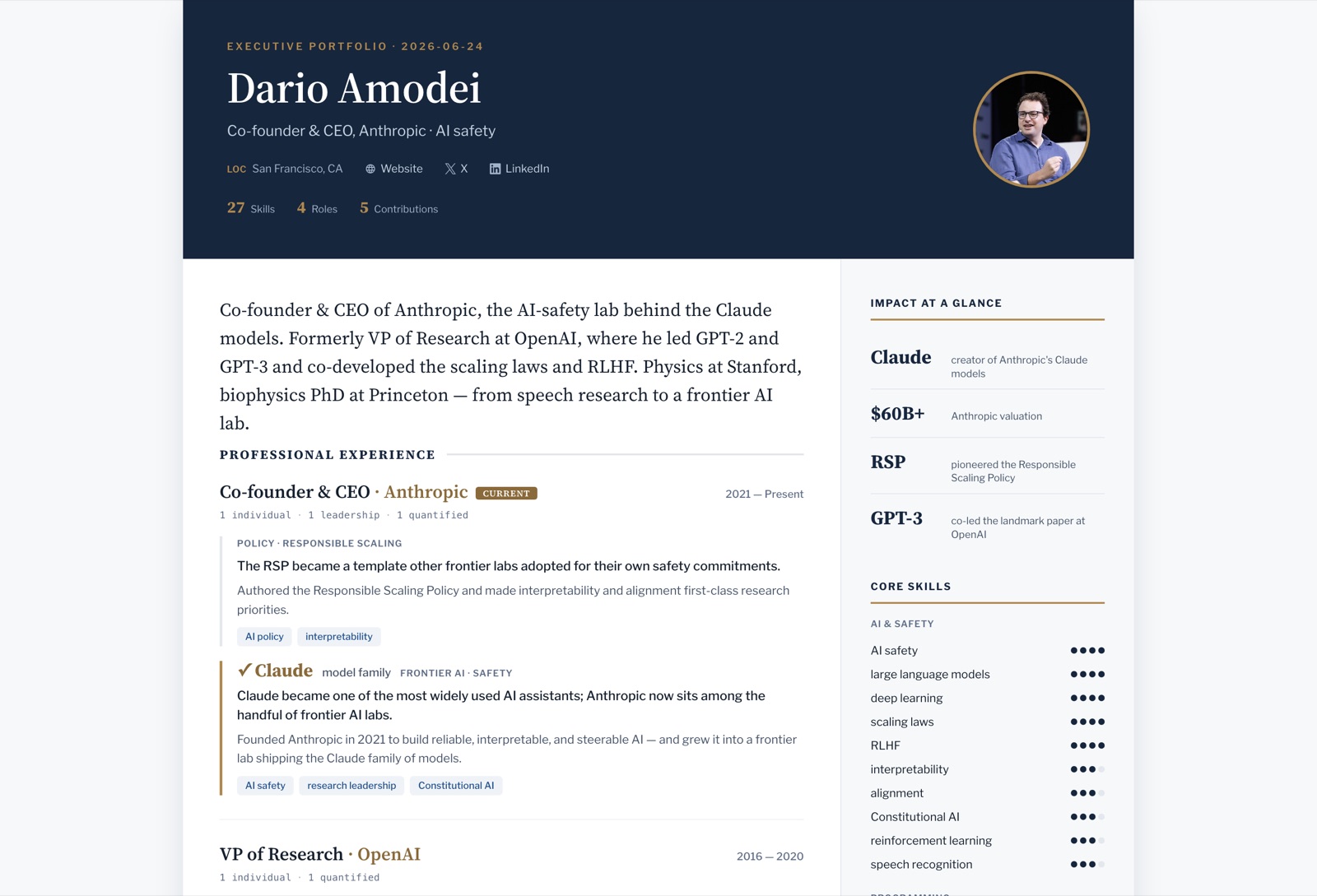
Executive
Boardroom quiet — deep ink, gold restraint, a page built for someone whose title speaks first.
 Open live →
Every design holds the same content — your timeline, your skills, your proof of work. Picking a style doesn't cost you anything; you can change it later too.